

The remark «I can do that too» is, it seems, heard by the guards of the Tretyakov Gallery more often than any other. It is always uttered in front of the exact same painting. A small canvas, a dark figure against a light background, a line of people wanting to take a picture. Adults usually scold children, and for good reason: the objection is valid. To answer it honestly, one has to drag into the light the entire early twentieth century, a freezing Petrograd exhibition, a quarrel between two geniuses behind a partition, a Paris anecdote thirty years in the making, and even a bank crash from the nineties. The story is long, but by the end it becomes clearer why museums hold onto this canvas tighter than they do to many ceremonial masterpieces.
How one evening set artistic Petrograd at odds
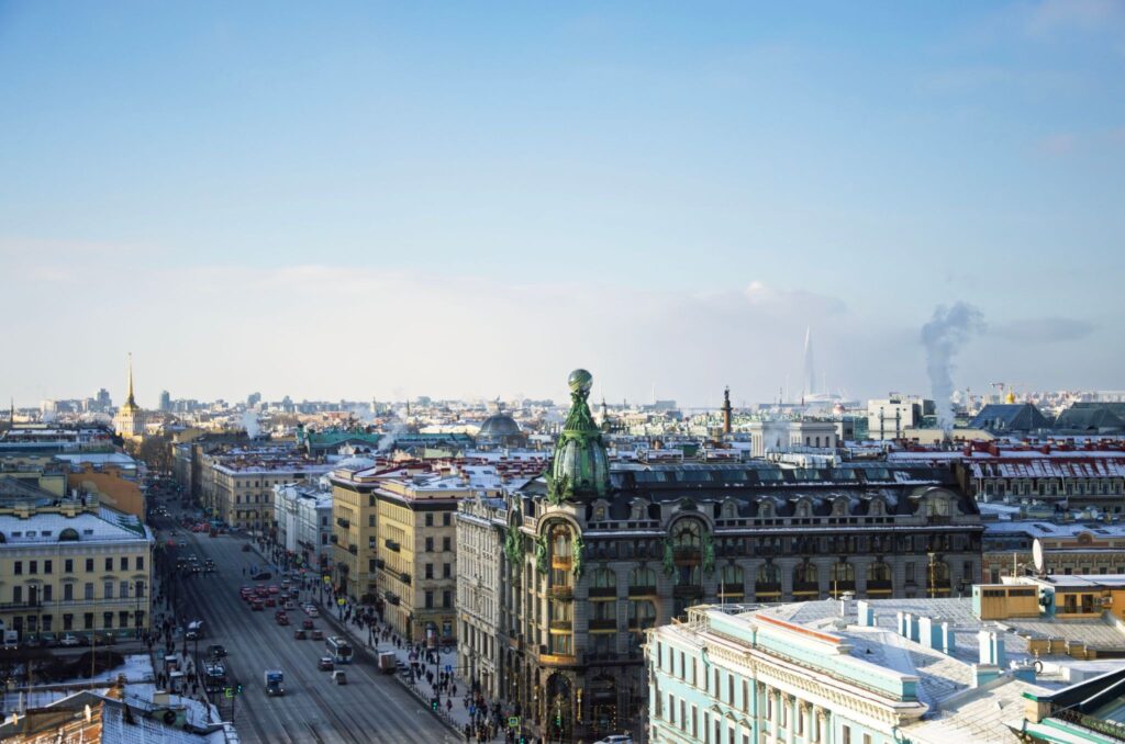
Let us begin with the place and time. December 1915, the second year of the World War, Petrograd is living on front-line reports and queues, and amid all this in the Adamini house on the Field of Mars, a painting exhibition is being prepared. It is being organized by Nadezhda Dobychina, a businesswoman and risk-taker; her art bureau took on things that respectable halls refused. The title of the exhibition puzzled the public even on the poster. «0,10,» zero-ten. The explanation was known to a narrow circle: the participants announced that they had passed through «zero forms,» and the participants themselves were supposed to be ten. Life, as usual, corrected the arithmetic; by the opening, there were more artists, but nobody bothered to change the signs.
Behind the scenes, a drama of its own was unfolding. Vladimir Tatlin, who was exhibiting counter-reliefs—three-dimensional structures made of iron and wood—did not want to hang on the same walls as Malevich's paintings and made no secret of it. They had a serious falling out, the displays had to be separated into different rooms, and each of the two hung his own manifesto by the entrance. The tension was further heightened by the fact that Malevich had kept his new works hidden from everyone until the very last moment. He painted them in a rush; the most important one was remembered later as having been finished almost on the eve of the opening, right over another composition that hadn't yet dried. That rush would make itself felt later—we will return to that.
The idea itself was not new, even to the author. Two years earlier, in the winter of 1913, the futuristic play «Victory over the Sun» was performed at the St. Petersburg «Luna Park.» Malevich designed the sets and costumes, Aleksey Kruchenykh wrote the transrational text, and Mikhail Matyushin composed the music. According to the plot, the sun was captured and buried in a concrete house, leaving the old world without light. The square, half-filled with black, first appeared on a sketch of the curtain for this opera. Just a piece of paper, nobody noticed it back then.
And now everyone noticed. On the nineteenth of December, the public climbed the stairs, paid for tickets, and saw a room containing thirty-nine works without any subject matter, with titles that clarified nothing. One of them was hung differently from the rest. Near the ceiling, diagonally across the corner, right where any Russian home would place an icon. The red corner was understood without explanation, and there proved to be more the offended than the admirers. At the entrance, a brochure was sold in which Malevich announced the birth of Suprematism (from the Latin supremus, «highest») and promised painting a future without the imitation of objects. Newspapers had enough of this to last for months.
Why did the artist need the void

It would be easiest to brush it off as mere shock value and calculated scandal. One circumstance prevents this. According to the memoirs of those close to him, after finishing the work, Malevich could neither sleep nor eat for a long time; his own discovery had frightened him. In his articles, he called the black plane the zero of forms, and in a letter to a close friend, even the royal infant. A person who is simply fooling the public does not behave that way.
Behind the loud words lay a completely sober thought. For centuries, European painting competed with nature, and the more convincing the faces, velvet, and grapes turned out, the more highly the masters were valued. By 1915, photography intervened in this competition—fast, cheap, and merciless toward mediocre painters. Portrait studios operated in every city. Malevich proposed that painting retreat to where the camera could not reach. Let color and form act directly on a person, without retelling the visible, much like music, of which no one demands a resemblance to objects.
In this program, the square took the place of the first word. Why the square, of all things? This is often explained as follows: squares do not exist in nature. The horizon curves, trees and rocks are asymmetrical, and even the walls of houses, if you look closely, are a bit crooked. A perfect quadrilateral exists only in the human mind, and it’s a convenient starting point for art that imitates nothing. Black paired with a white field had a similar effect; it hinted at neither night nor mourning, but simply turned off all other colors and left the viewer alone with the form.
Up close, incidentally, the painting bears little resemblance to a technical drawing. The figure’s sides are irregular; none of them is parallel to another, and within the blackness, brushstrokes are visible, along with areas of dense and transparent paint. Malevich did not use a ruler; he was noticeably more interested in the living surface than in geometric precision. A follow-up to *The Square* appeared quickly, followed by *The Black Circle*, «Black Cross,» «Red Square,» and, in 1918, «White on White,» in which the figure almost merges with the background and the entire system reaches its own limit.
The “red corner” deserves special mention; without it, the concept loses half its meaning. In peasant and merchant homes, the corner opposite the entrance was reserved for icons; people would cross themselves there from the threshold, and honored guests were seated there. The viewer of 1915 had absorbed this “grammar of space” from childhood, and its transposition into the exhibition hall struck a chord more powerfully than any manifesto. Malevich hung his own art in this sacred space and thereby offered the city a new object of faith. Few could agree with this, but no one remained indifferent.
At home, this plot is easy to test out in a conversation with a child. Ask what they see in the black field, and refrain from making corrections. A window into the darkness, a turned-off screen, a hole, just paint. Any answer is fine, because a painting without a plot gives the right to meaning to the viewer themselves. In this regard, it is structured more like a mirror than a story.
Five details the label keeps silent about
Black color
According to technical research by the Tretyakov Gallery, Malevich did not use a ready-made black pigment from a tube: the black is mixed from several paints. Hence the depth and slight heterogeneity of the tone, noticeable up close.
White field
The border around the figure reads as empty, unoccupied space. Malevich called it the desert of pure feeling into which he brought painting.
Red corner
In the only surviving photograph of Malevich’s exhibition hall, twenty-one of the thirty-nine works are visible: the canvases are hung in tight rows, and only one is raised above them and turned at an angle. This image has long since become iconic.
Crack Network
The original has its own recognizable cracking pattern. Restorers do not mask it: the craquelure is considered part of the original and one of the signs by which the first square is distinguished from repetitions and fakes.
Dated 1913
The painting was created in 1915. However, the artist’s date, as listed in exhibitions and catalogs, is always 1913—the year of the theatrical sketch for the opera *Victory Over the Sun*.
A dispute that began with a newspaper column

Alexander Benois was the most vocal opponent. It’s important to understand who he was. A champion of modern art, an ideologue of «The World of Art,» a man of immense taste and authority. And this very man published a column full of fury about the square, in which he saw, in the red corner, blasphemy, a proclamation of emptiness, and the end of culture. After that, the public had no reason to doubt. Malevich, however, could not remain silent and responded to the criticism with a defiant letter, the gist of which boiled down to one simple thing: the artist is proud of his «naked» square because it bears no resemblance to any master of the past, and he is willing to take accusations of emptiness as praise for its novelty. Both were intelligent, yet neither listened to the other, and their correspondence reads today as a prologue to all subsequent debates about contemporary art. The square also came under fire from more ordinary people. Satirists outdid one another with witty remarks, indignant letters poured into the editorial office, and the word «square» became a convenient target in satirical columns for a long time.
The skeptics had an even more serious trump card up their sleeves. Such grim scenarios had already occurred. In 1882, in Paris, the writer Paul Biyo brought a canvas painted entirely black to an exhibition of humorists, bearing a mocking caption about a nighttime brawl in a basement; and later Alphonse Allais compiled an entire album of such monochromatic sheets with humorous titles. Paris laughed it off and forgot about it; there was no theory behind the images. The most unexpected revelation in this line of inquiry didn’t come to light until 2015. Staff at the Tretyakov Gallery, while examining the first square, spotted a half-erased pencil inscription on the white field, and what they read matched the title of that painting by Biyo almost word for word. According to a widely accepted interpretation, Malevich himself left the mark for posterity. It turns out he knew about the Parisian joke and consciously built a philosophy in place of the anecdote. The French had their laugh and went their separate ways; Malevich, from that black plane, brought forth a school, manifestos, students, and a program for the reorganization of everything visible—from tableware to cities.
Now, about the «I can do that too» attitude. Anyone can draw a square—there’s no arguing that. But what is valued in this painting is not the act of drawing itself. To be the first to make such a gesture—in 1915, against all tradition—to justify it, to withstand the persecution, and to live to see that gesture become a language—only one person in all of history managed to do so. Twentieth-century art, in general, learned to value the act on par with the craft, and the square set the precedent. The craft itself isn’t straightforward either. Restorers describe the surface of a canvas as a multilayered organism with its own character, and they can instantly spot forgeries by the dead, even blackness of the surface. It’s easy to replicate a silhouette. It’s nearly impossible to replicate a painting.
How many squares did Malevich actually paint
The question is not rhetorical; very few people know the answer. Four. The first one, the very same one from the exhibition, now lives in the Tretyakov Gallery; its side is a little less than eighty centimeters. Age is harder on it than on the others. The black field is crisscrossed with craquelure, with the underlying color showing through in the cracks. That is how that rush job turned out. In 2015, an X-ray revealed two earlier compositions beneath the square, one cubo-futurist, the other almost suprematist. Before the vernissage, the artist had grabbed a canvas he had already started. The research, by the way, was a detective story in its own right; physicists and restorers spent months scanning the canvas in various ranges and combining the images, and the announcement of the results made world news, a rare occurrence for restoration science.
The second square, the largest one—one meter on each side—was painted around 1923 together with his closest students. It was intended for the Soviet pavilion at the Venice Biennale, as part of a triptych that also included a black circle and a black cross. The works never made it to Italy; the organizers’ intrigues got in the way. Malevich took this setback very hard; his correspondence shows just how much he had been looking forward to European recognition, especially since there was more interest in Suprematism abroad than at home. In the end, the triptych remained entirely at the Russian Museum. The third version was commissioned in 1929 by the Tretyakov Gallery itself, which was preparing a solo exhibition of the artist’s work. By that time, the original had become quite cracked; they wanted to hang a black panel without the grid of wrinkles next to it, so Malevich repainted the square from scratch.
The story behind the fourth one was almost an adventure. Small—about half a meter—and dating from the early 1930s, it disappeared from view for six decades and resurfaced in 1993 in Samara, where the owners brought it to the Incombank office to use as collateral for a loan. Then the bank went under, the painting became entangled in legal battles among creditors, and the matter was finally resolved only in 2002, when Vladimir Potanin paid about a million dollars and transferred the canvas to the Hermitage. Comparing all four versions is a unique pleasure; the colors differ, the texture varies—the black in the early version is deep and uneven, while in the later ones it is drier and duller. Anyone who sees the Moscow and St. Petersburg versions side by side will quickly abandon the notion that they are identical copies.
Four versions of a square side by side
| Version | Side length | Where is it stored? | What is notable about |
|---|---|---|---|
| 1915 | about 79.5 cm | The Tretyakov Gallery, Moscow | Original from the «0.10» exhibition. Beneath the paint layer lie two earlier compositions and a pencil inscription, discovered in 2015. |
| around 1923 | about 106 cm | State Russian Museum, St. Petersburg | The largest one. Part of a triptych featuring a circle and a cross, which was being prepared for the Venice Biennale, but the works never made it there. |
| 1929 | about 80 cm | The Tretyakov Gallery, Moscow | An artist's reproduction commissioned by the gallery for a solo exhibition, to replace the cracked original. |
| early 1930s | about 53.5 cm | The Hermitage, St. Petersburg | The smallest one. It surfaced in Samara in 1993, and in 2002 it was bought by Vladimir Potanin and donated to a museum. |
Size. About 79.5 cm
Museum. The Tretyakov Gallery, Moscow
Original from the «0.10» exhibition. Beneath the paint layer lie two earlier compositions and a pencil inscription, discovered in 2015.
Size. About 106 cm
Museum. State Russian Museum, St. Petersburg
The largest one. Part of a triptych featuring a circle and a cross, which was being prepared for the Venice Biennale, but the works never made it there.
Size. About 80 cm
Museum. The Tretyakov Gallery, Moscow
An artist's reproduction commissioned by the gallery for a solo exhibition, to replace the cracked original.
Size. About 53.5 cm
Museum. The Hermitage, St. Petersburg
The smallest one. It surfaced in Samara in 1993, and in 2002 it was bought by Vladimir Potanin and donated to a museum.
Traces of the square a century later
Vitebsk, 1920. Trams painted with geometric shapes run through the city, suprematist posters adorn advertising pillars, and young artists wear black squares sewn onto their sleeves. All of this is the everyday life of UNOVIS, the association of champions of the new art, which gathered around Malevich at the local art school. The school was founded by Marc Chagall, resulting in an ironic chain of events. Chagall invited El Lissitzky to teach; in the autumn of 1919, Lissitzky brought Malevich to Vitebsk, and six months later, the students almost universally abandoned the flying lovers for strict geometry, forcing the founder to leave his own school. For a few years, the provincial town became a global laboratory for non-objective art.
Further on, the ideas diverged on their own. Lissitzky led suprematism into architectural fantasies and book design. Students painted porcelain from the former Imperial Factory with geometry; today, these cups sit in museum display cases in various countries. Malevich himself in the 1920s tinkered with arkhitektons, plaster models of buildings of the future. In 1921, Alexander Rodchenko took the idea to its absolute limit by exhibiting three canvases flooded with flat red, yellow, and blue, and declaring that easel painting had thereby come to an end. After World War II, monochrome painting arrived in the West as well. Yves Klein invented his own shade of blue and patented its formula, Robert Rauschenberg exhibited white canvases, and Ad Reinhardt spent years painting barely distinguishable shades of black. All of this, whether intentionally or not, continued the conversation from the Petrograd corner. At the same time, the heritage dissolved into everyday life. Strict book covers, posters on a clean background, screens with their grid of rectangles grew, among other things, out of the Vitebsk exercises, of which the people who use them are usually unaware.
Malevich himself surprised everyone once more in the late twenties by returning to figurative painting. He painted peasants with empty ovals instead of faces, then portraits in the manner of the old masters, and now he signed his work without letters, using a tiny black square in the corner of the canvas. The sign had supplanted the name. The artist died in 1935 in Leningrad; he was buried in a coffin painted according to his own suprematist sketches, and over his grave near Moscow, his students erected a white cube with a square. After that, the painting took on a life of its own: long years in storage, then monographs in the West, a triumphant return to exhibition halls, reproductions on t-shirts and book covers, and memes. Museums celebrated the painting's centenary in 2015 with exhibitions and that very sensational discovery beneath the paint layer—a better gift for the anniversary could not have been devised even on purpose. Stand for five minutes in the Tretyakov Gallery hall and listen to what strangers are saying by the canvas. About money, about meaning, about whether what they see should be considered art at all. Word for word, the conversations of the winter of 1915.
When a painting teaches how to speak

The square also has a very practical, linguistic use. Try discussing it without using words like intent, plane, imitation, or manifesto. You won't be able to; the vocabulary will naturally follow. At our school, discussions about art are built into the classes for this exact reason—during them, children describe, doubt, and search for Russian words to describe things that cannot be named right away. We teach children from four to seventeen years old, tailoring the program to the specific child; one needs their first phrases, while another needs a heated debate about the avant-garde. You can find out if this approach suits your family by taking two free lessons. During the first one, a methodologist will talk with the parents and the child, assess their level, and select a suitable group. The second will take place in a mini-group with a teacher, where the child will attend a real class and decide for themselves if they find it interesting. Tell us what your child is passionate about, and we will try to turn it into a topic for conversation in Russian.
<!— ССЫЛКА НА ЭТАПЕ CMS: якорь «двух бесплатных уроках» ведет на https://www.palmeschool.com/services/russian-language-for-bilinguals/ —>
Home

«The Black Square was first shown in December 1915 at the 0,10 Petrograd exhibition, in the corner usually reserved for icons, in place of an icon, and people have not stopped discussing the painting since that evening. Malevich put into it the zero of forms, the point where imitative painting ends and the art of pure color begins. Mockers accompanied the canvas from the very first evening, reminding everyone that the French had exhibited humorous single-color pictures as early as the 1880s. Judging by the inscription beneath the paint layer, the artist remembered this better than anyone. The difference turned out to be in scale. Nothing grew out of the Parisian anecdote, whereas the Petrograd square gave rise to a school, porcelain, architectural projects, and a noticeable part of contemporary design. There are four authorial versions, which are distributed among three museums: the Tretyakov Gallery, the State Russian Museum, and the Hermitage. The question of whether we are looking at a masterpiece or a prank has been asked for the second century in a row. A more weighty compliment to the painting cannot be imagined.
Frequently Asked Questions
Is it true that at the first exhibition the painting was called differently?
Yes, in the 0.10 catalog it was listed as «Four-corner.» The sides of the figure diverge, with no parallel ones among them, so the author's name honestly described what was hanging on the wall. The familiar name became established later, along with fame.
Why did the Black Square end up painted over another painting?
Canvas cost money, and painting over unsuccessful works was common practice among artists. Malevich was also in a hurry for the opening and grabbed the first suitable canvas he had already started. For science, this economy turned out to be a stroke of luck; today, the lower layers reveal the author's path to Suprematism.
Why did Malevich date the painting 1913 if he painted it in 1915?
The artist considered the theatrical sketch for «Victory over the Sun» to be the birth of the square and insisted on the year of its conception. The date the canvas was executed concerned him noticeably less.
How much is the «Black Square» worth in monetary terms?
Not a single museum will sell its version, and the insurance amounts mentioned by experts are measured in tens of millions of dollars. Only one real deal is known. In 2002, the future Hermitage canvas was bought from the creditors of a bankrupt bank for about a million, and the participants themselves admitted the price was symbolic.
How does Suprematism differ from Kandinsky's abstractions?
Kandinsky moved toward abstraction through music and mood; his compositions remain spontaneous painting, where color patches express feelings. Malevich's system is rational, assembled from the simplest shapes, and he extended it far beyond the frame onto dishware, buildings, and the urban environment.
How to explain the meaning of this painting to a child in simple words?
A painting can be compared to a pause between two melodies. The previous music has faded away, the new one has not yet begun, and the silence makes you listen closely. The reverse approach also works well: asking what the child saw in the dark figure themselves. No one has a ready-made answer here, and that is the whole point.